Online Store Design Inspiration: Boost Your Sales Now
online store design inspiration

Online Store Design Inspiration: Boost Your Sales Now

Unlock the secrets to a stunning and successful online store with our expert design insights and actionable strategies.

Get Inspired Today

Key Takeaways

  • ✓ 93% of consumers consider visual appearance a key factor in purchasing decisions.
  • ✓ A well-designed website can increase conversion rates by up to 200%.
  • ✓ Mobile responsiveness is crucial; 79% of smartphone users have made a purchase on their device.
  • ✓ Website loading speed significantly impacts user experience and bounce rates.

How It Works

1
Understand Your Brand & Audience

Define your brand identity, values, and target demographic. This foundational understanding will guide all your design choices, ensuring authenticity and resonance.

2
Explore Design Trends & Best Practices

Research current e-commerce design trends and established best practices for user experience (UX) and user interface (UI). Look for elements that align with your brand and appeal to your audience.

3
Benchmark Competitors & Industry Leaders

Analyze successful online stores in your niche and beyond. Identify what works well, what differentiates them, and how you can adapt these insights to create a unique and compelling experience.

4
Iterate, Test, & Refine Your Design

Implement your chosen design elements, then rigorously test them with real users. Gather feedback, analyze performance metrics, and continuously refine your store's look and functionality for optimal results.

The Psychology Behind Effective E-commerce Website Design
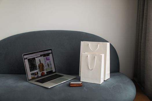
Online shopping setup with a laptop and shopping bags on a stylish couch. Photo: Cup of Couple / Pexels
In the bustling digital marketplace, your online store isn't just a place to sell products; it's a carefully crafted experience designed to evoke emotion, build trust, and ultimately, drive conversions. The psychology behind effective ecommerce website design delves deep into understanding human behavior, perception, and decision-making processes. It's about more than just aesthetics; it's about creating an intuitive, enjoyable, and persuasive journey for every visitor. Color psychology plays a significant role, with different hues eliciting varied emotional responses. For instance, blue often conveys trust and reliability, making it popular for financial institutions, while green suggests nature, growth, and health, frequently used by eco-friendly brands. Red, on the other hand, can create urgency or excitement, ideal for promotions or calls to action. However, the impact of color is also culturally dependent, requiring careful consideration of your target audience. Beyond color, the strategic use of white space is paramount. Often underestimated, white space (or negative space) isn't just empty area; it's a powerful design tool that enhances readability, reduces cognitive load, and draws attention to key elements. By preventing visual clutter, it allows products and important information to breathe, making the user experience much more pleasant and less overwhelming. A cluttered design can lead to high bounce rates, as users struggle to find what they're looking for. Furthermore, the principles of Gestalt psychology are incredibly relevant. Concepts like proximity, similarity, continuity, and closure help designers create visually cohesive and easily digestible layouts. Grouping related items together (proximity), using consistent styling for similar functions (similarity), and guiding the eye along a natural path (continuity) all contribute to an intuitive user interface. This psychological understanding ensures that your design choices aren't arbitrary but are rooted in scientific principles that guide users toward desired actions, such as adding items to a cart or completing a purchase. Ultimately, a successful online store design leverages these psychological insights to create an environment where customers feel comfortable, confident, and compelled to engage with your brand.

Key Elements of High-Converting Online Store Design Inspiration

Laptop displaying online shopping with boxes and cart, representing ecommerce. Photo: Nataliya Vaitkevich / Pexels
When seeking online store design inspiration, it's crucial to focus on elements proven to boost conversions, not just look good. A high-converting design seamlessly blends aesthetics with functionality, guiding visitors effortlessly from browsing to buying. One of the most critical aspects is intuitive navigation. Your customers should be able to find what they're looking for within a few clicks, regardless of where they land on your site. This means clear categories, a prominent search bar, and well-organized menus. Consider mega-menus for larger inventories, which allow you to display multiple levels of categories at once, improving discoverability. Breadcrumbs are also invaluable, helping users understand their location within your site structure and easily navigate back. High-quality product imagery and video are non-negotiable. In an online environment, customers can't physically touch or examine products, so your visuals must do the heavy lifting. Invest in professional photography that showcases products from multiple angles, in different contexts, and with zoom capabilities. Product videos can further enhance the experience, demonstrating features and benefits in a dynamic way. Don't forget user-generated content (UGC) like customer photos and videos, which build social proof and trust. Compelling product descriptions are equally vital. These aren't just lists of features; they tell a story, highlight benefits, and address potential customer pain points. Use persuasive language, clear formatting, and include all necessary specifications. Transparent pricing and shipping information are also paramount. Hidden costs are a major conversion killer. Clearly display product prices, any applicable taxes, and shipping costs upfront or provide easy access to this information. Offering various shipping options and clearly stating return policies builds confidence. Finally, a streamlined checkout process is the ultimate goal. Minimize the number of steps, allow guest checkout, offer multiple payment options, and clearly display progress indicators. Each extra field or confusing step can lead to cart abandonment. Integrating trust signals, such as security badges, customer reviews, and testimonials, throughout the buying journey reinforces credibility and encourages completion of the purchase. By prioritizing these key elements, you transform your online store into a conversion powerhouse, turning inspiration into tangible results.

Leveraging Modern UI/UX Trends for Enhanced Storefront Aesthetics

Woman using smartphone for online shopping with credit card in hand, festive background lighting. Photo: AS Photography / Pexels
Staying abreast of modern UI (User Interface) and UX (User Experience) trends is essential for any online store looking to maintain a competitive edge and provide a superior customer journey. These trends are not merely fads; they often represent evolving user expectations and technological advancements that can significantly enhance your storefront's aesthetics and functionality. One prominent trend is the adoption of minimalist design. This approach focuses on simplicity, clarity, and removing unnecessary clutter, allowing products and calls to action to stand out. Clean layouts, ample white space, and a limited color palette contribute to a sophisticated and easy-to-navigate experience. While it might seem counterintuitive to remove elements, a minimalist design often leads to a more focused and efficient user journey, reducing cognitive load and improving conversion rates. Another powerful trend is the integration of rich animations and micro-interactions. Subtle animations on buttons, hover effects on product images, or loading indicators can make the user experience more engaging and responsive. Micro-interactions – small, often overlooked visual cues – provide instant feedback to users, making the interface feel more alive and intuitive. For example, a quick animation when an item is added to a cart confirms the action, reassuring the user. However, it's crucial to use these sparingly and purposefully, as excessive animation can be distracting or slow down your site. Personalization and AI-driven recommendations are also transforming storefront aesthetics. Modern platforms allow for dynamic content display based on user behavior, past purchases, and browsing history. This creates a highly relevant and unique shopping experience for each customer, making them feel understood and valued. AI can power product recommendations, personalized homepages, and even customized email campaigns, all contributing to a more tailored and aesthetically pleasing storefront that anticipates customer needs. Furthermore, the rise of dark mode interfaces offers a fresh aesthetic alternative. While not suitable for all brands, dark mode can reduce eye strain, conserve battery life on mobile devices, and provide a sleek, modern look. Offering it as an option can cater to a broader audience and demonstrate a commitment to user comfort. Finally, inclusive design principles are gaining traction. This means designing for accessibility, ensuring your online store is usable by people with diverse abilities. Considerations like sufficient color contrast, keyboard navigation, and clear labeling not only broaden your audience but also often result in a more user-friendly experience for everyone. By embracing these modern UI/UX trends, you can create a visually stunning and highly functional online store that truly resonates with contemporary consumers, setting your brand apart in the competitive ecommerce landscape.

Common Online Store Design Mistakes to Avoid & Practical Tips

Close-up of a toy shopping cart on a vivid yellow surface, casting shadows. Photo: Sergey Meshkov / Pexels
Even with the best online store design inspiration, it's easy to fall into common pitfalls that can deter customers and sink your sales. Being aware of these mistakes and implementing practical tips can save you countless hours and lost revenue. One major mistake is neglecting mobile responsiveness. With the majority of internet traffic now coming from mobile devices, a site that isn't optimized for smaller screens is effectively alienating a huge portion of its potential customer base. Ensure your design adapts seamlessly to various screen sizes, with easy-to-tap buttons and readable text. Another common error is slow loading times. In today's fast-paced digital world, users expect instant gratification. A page that takes more than a few seconds to load will lead to high bounce rates. Optimize images, leverage browser caching, and consider a Content Delivery Network (CDN) to speed up your site. Over-cluttering your homepage is another design faux pas. While you might want to showcase everything, a busy homepage overwhelms visitors. Prioritize your most important products, promotions, or categories, using clear calls to action. Remember the power of white space to guide the eye. Ignoring customer feedback and analytics is a critical oversight. Your website is a living entity, and customer behavior provides invaluable insights. Use heatmaps, session recordings, and A/B testing to understand how users interact with your site and identify areas for improvement. Don't just set it and forget it; continuously iterate based on data. Here are some practical tips to refine your online store design: * **Prioritize a strong visual hierarchy:** Guide your visitors' eyes to the most important elements first, using size, color, and placement. * **Maintain brand consistency:** Ensure your logo, colors, fonts, and tone of voice are consistent across all pages and marketing materials. * **Simplify the checkout process:** Reduce the number of steps, offer guest checkout, and clearly display progress. * **Integrate high-quality customer reviews:** Social proof is incredibly powerful. Make reviews easy to find and read. * **Optimize product pages:** Use clear descriptions, multiple high-resolution images, and videos. * **Provide multiple payment options:** Cater to diverse customer preferences. * **Ensure easy access to customer support:** A visible help section or chat option builds trust. * **Test rigorously across devices:** Before launching, test your site on various browsers, devices, and screen sizes.

Comparison

FeatureConversion-Focused DesignBasic Template DesignOverly Artistic Design
Navigation ClarityExcellent (Intuitive & Efficient)Moderate (Standard, sometimes clunky)Poor (Abstract, confusing)
Loading SpeedOptimized (Fast & Responsive)Variable (Depends on template & content)Slow (Heavy animations, large files)
Mobile ResponsivenessSeamless (Adaptive to all devices)Good (Often built-in)Poor (Not prioritized, breaks easily)
Call to Action (CTA)Clear & ProminentStandard, sometimes hiddenSubtle, often missed
Trust Signals✓ (Reviews, security badges)✗ (Limited or generic)✗ (Focus on visuals only)
Product PresentationHigh-Res Images, Video, UGCBasic images, textStylized, sometimes impractical
Checkout ProcessStreamlined, minimal stepsStandard, can be lengthyComplex, multi-page

What Readers Say

"This guide completely transformed how I think about my online store's aesthetics. The tips on white space and mobile optimization were game-changers. My bounce rate has significantly decreased since implementing these ideas!"

Sarah J. · Austin, TX

"Finally, a resource that breaks down online store design inspiration into actionable steps. The section on psychological triggers helped me redesign my product pages, and I've seen a noticeable uptick in conversions."

Mark D. · Miami, FL

"Following the advice in this article, I revamped my entire checkout flow. It went from a clunky 5-step process to a smooth 3-step one. My cart abandonment rate dropped by 15% in just two weeks – truly incredible results!"

Emily R. · Seattle, WA

"The content is incredibly detailed and helpful, especially the UI/UX trends. While some concepts required a bit of technical understanding, the overall value is immense. I appreciate the focus on data-driven design decisions."

David L. · Chicago, IL

"As a small business owner, I was overwhelmed by all the design choices. This article provided clear, concise online store design inspiration tailored for boosting sales. It's like having a design consultant in my pocket!"

Jessica M. · Denver, CO

Frequently Asked Questions

What is the most important aspect of online store design inspiration?

The most important aspect is focusing on user experience (UX) and conversion rates. While aesthetics are crucial, they must serve the ultimate goal of making it easy and enjoyable for customers to find products, trust your brand, and complete a purchase. A beautiful but confusing store will not convert.

I'm not a designer; can I still create a great online store?

Absolutely! Many e-commerce platforms offer intuitive drag-and-drop builders and pre-designed themes that can be customized. Focus on understanding the principles of good design, use high-quality assets, and leverage the tools available. This article provides inspiration even for non-designers.

How often should I update my online store's design?

While there's no fixed rule, it's good practice to review your design annually and consider significant updates every 2-3 years. E-commerce trends evolve rapidly, and refreshing your design keeps your store modern, engaging, and competitive. Minor tweaks and optimizations can be done continuously based on analytics.

What's the typical cost for a professionally designed online store?

The cost can vary wildly depending on complexity, platform, and features. A basic store using a customizable template might cost a few hundred to a couple thousand dollars. A custom-designed, highly functional store with unique features could range from $5,000 to $50,000 or even more. Focus on ROI.

How does online store design differ from a regular website design?

Online store design has a primary objective: to sell products. This means a much stronger emphasis on product presentation, secure checkout processes, trust signals, and clear calls to action. Regular website design might prioritize information dissemination, lead generation, or brand awareness over direct sales.

Who should use online store design inspiration?

Anyone involved in e-commerce, from new business owners launching their first store to established brands looking to refresh their online presence. It's also invaluable for web designers, marketers, and product managers seeking to optimize their digital storefronts for better performance and customer satisfaction.

Is it risky to follow design trends too closely?

While it's important to be aware of trends, blindly following them can be risky. Some trends are fleeting, and adopting too many can make your store look generic or quickly outdated. It's best to understand the underlying principles of a trend and adapt elements that genuinely enhance your brand and user experience, rather than just copying.

What are future trends in online store design?

Future trends include increased personalization through AI and machine learning, immersive experiences like AR/VR for product visualization, voice commerce integration, sustainable and ethical design emphasis, and hyper-local shopping experiences. Mobile-first design will continue to evolve, focusing on even more seamless interactions.

Ready to transform your digital storefront? Leverage these online store design inspiration insights to create an e-commerce experience that not only captivates your audience but also drives unprecedented sales and builds lasting brand loyalty. Start designing your success story today.

Topics: online store design inspirationecommerce website designstorefront aestheticsuser experience optimizationconversion-focused design
Leo List
Brampton weed
Adultwork EstrelaBet Vai de Bet R7 Bet Betão Galera Bet Rainbet Bet9ja Shop SportyBet BetKing Sisal Loto Foot Hollywoodbets YesPlay Odibets RushBet Jugabet BetWarrior BetCity MSport betPawa Fortebet